Eupnea
One app where patients book, doctors manage their time, and clinic admins keep it all running.
- Role
- Product designer, research to final screens
- Platform
- Mobile app for three roles
- Pace
- One-week design sprint
- Users
- Patients, doctors, clinic admins
In short
- Overview
- A mobile app for booking and rescheduling appointments between patients, doctors and clinic admins. I ran the design in a one-week sprint, from first interview to final screens.
- The problem
- Patients couldn’t book easily, doctors weren’t told when they were booked, and admins couldn’t see who was free.
- The solution
- One app, three roles. Rescheduling asks why, so nobody is left guessing.
- What they said
- Interviews with patients, clinic admins and doctors, and four findings.
- The final screens
- Twelve screens across the patient, doctor and admin apps.
- What reviewers changed
- Three pieces of feedback, and what I did about each.
The problem
Everyone was working around the process.
Patients couldn’t book easily, doctors weren’t told when they were booked, and admins couldn’t see who was free.
Patients named five problems with their current apps: finding a preferred doctor, switching between hospitals, sharing their records, waiting a long time for a request to be accepted, and agreements that aren’t kept.
Key decisions
One app, three roles.
Patients pick a doctor and a slot in a few taps. Doctors approve requests and open their own slots. Admins approve doctors and see the whole clinic.
Booking comes first
The patient starts from a doctor, not a form.
Rescheduling asks why
A short reason goes to the doctor.
Three roles, three colours
The apps never get mixed up.
One big button
A raised calendar button sits in every tab bar.
How I worked
Ten steps in one week.
- 01
Design brief and scope
- 02
Understanding the problem
- 03
Defining the problem
- 04
Qualitative research
- 05
Explorations
- 06
Sketching
- 07
Prototyping
- 08
Usability testing
- 09
Validate
- 10
Presentation
Research
I asked three groups what hurts.
Each group got its own set of questions: how they book today, what a reminder or a record share would mean to them, and what they’d want from rescheduling. Here is what they said, lightly edited for spelling.
Patients
“It’s very difficult to book an appointment with my current app. I will give it a zero.”
A patient
Patients
“I prefer telehealth, but unfortunately it is not available.”
A patient
Patients
“Record sharing is very important, and I also want to be able to book for telehealth.”
A patient
Clinic admins
“If the doctor isn’t available because of an emergency, I want to be responsible for rescheduling.”
A clinic admin
Clinic admins
“A patient was angry because she wasn’t attended to, as the doctor wasn’t available. That’s very bad.”
A clinic admin
Clinic admins
“I want to be able to remove a doctor who is no longer in my clinic.”
A clinic admin
Doctors
“I can’t access patient records. If I see something better, I will surely go for it.”
A doctor
Doctors
“I don’t even get notified when I’m being booked.”
A doctor
Doctors
“If I can’t reschedule after an unexpected event, the patient may leave a bad review without knowing anything about me.”
A doctor
Findings
What the interviews added up to
Booking is the broken part
Patients named five problems with their current apps, from finding a preferred doctor to requests that take too long to be accepted.
Telehealth fits real lives
Busy patients prefer it, and evening slots suit them better. One patient said they would pick it over their current app.
Records should follow the patient
Patients want to share their records, and doctors can’t reach them. Both groups asked for it without being prompted.
Rescheduling needs an owner
Doctors need to move appointments without penalty, and admins want to step in when a doctor can’t make it.
Personas
Who I designed for
Lovette Rinder
Doctor · Anesthesiologist, 10 years’ experience
Goals
- Give patients the highest quality of care
- Stay up to date on advances in anesthesia
- Mentor and train future anesthesiologists
Frustrations
- Long hours and demanding schedules
- Complex, ever-changing medical information
- Remembering appointments
“I am a very busy person. I love my job a lot as a medical practitioner but it is very difficult to manage my appointments.”
Benjamin Desmond
Patient · Software developer
Goals
- Organise tech training for new techies
- Build new products that solve analytics problems
- Work with advanced technicians in the industry
Frustrations
- Unable to manage appointments
- Not able to schedule telehealth
- Prefers video consultation
“I value good check-up should be enforced for everyone in the society.”
Rosa Emily
Admin · Healthcare administrator
Goals
- Enhance patient care
- Improve operational efficiency
- Strengthen financial performance
Frustrations
- Can’t manage the activities of patients and doctors
- Can’t see patient records digitally
- Can’t see booked appointments
“I believe in a good management system especially for health.”
User stories
What each person needs to get done
Patient stories
As a patient, I want to:
- Share my hospital record with my doctor
- See reminders for my appointment
- Chat with my doctor to follow up on the prescription
- Schedule and cancel appointments
- Book doctors for a home checkup
- Receive a message from my doctor if I wasn’t able to come
Doctor stories
As a doctor, I want to:
- Reschedule appointments
- Request a patient’s record
- Add my slots without stress
- Manage my appointments
- Receive reminders, especially for telehealth
- Chat with patients for follow-up
Storyboards
Two stories I drew first
Before any screens, I storyboarded a day in the life of a patient and of a doctor, to find the moments where the app earns its place.
Benjamin, the patient
A freelance developer works at night, when there’s less distraction.
- He checks his to-do list and finds a hospital check-up tomorrow.
- He’s sad: he’ll be exhausted in the morning and can’t go out at all.
- He browses online and finds the Eupnea app.
- He fills in the form and books his favourite doctor.
- He sets the app to remind him five minutes before.
- The doctor discusses his test results and asks for his records.
- The session ends after 30 minutes and he reviews the doctor, happy.
Dr Lovette, the doctor
A compassionate physician struggles to give care without patients’ past medical histories.
- She learns about the Eupnea app through the admin.
- She downloads it right away.
- She gets a telehealth booking notification and accepts it quickly.
- She requests the patient’s record to decide what to prescribe and test.
- She prescribes a better medication.
- The session ends and she’s happy with her service.
User flows
Three roles, three flows
I mapped how each role moves through the app before drawing a single screen, so rescheduling is reachable from every one of them.
Patient
Home → Doctors → Pick a time → In person or telehealth → Describe symptoms → Confirm
Doctor
Home → Appointment requests → Calendar → Set a slot → Confirm
Admin
Home → Doctor requests → Pending → Approve or remove → Reports → Messages
The final screens
One system, three apps.
Mint pages, white cards, green for actions, and warm cream for anything that needs you.
The patient app is maroon on the design board, the doctor app green, and the admin app near-black, so the roles never get mixed up in a review.
01 · Patient
Find, book, join.
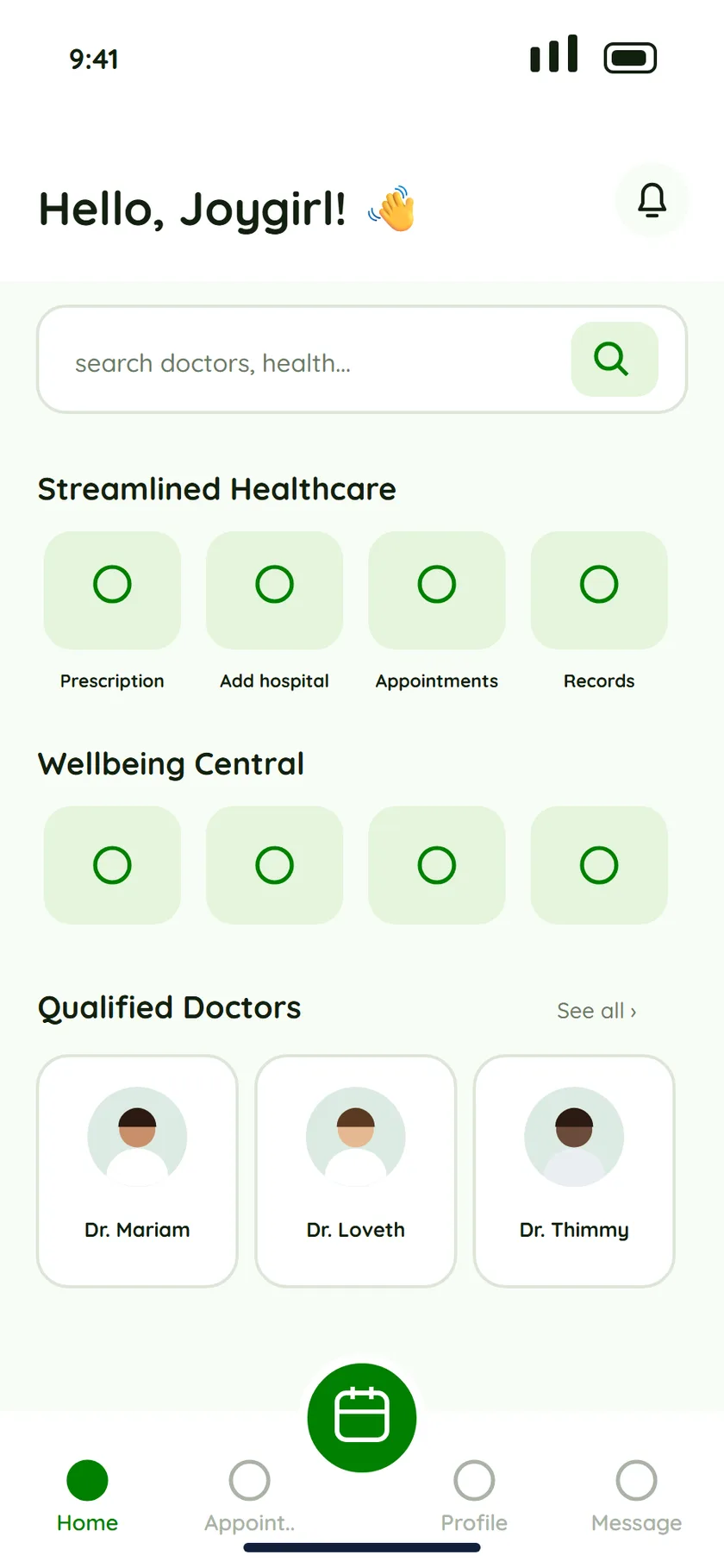
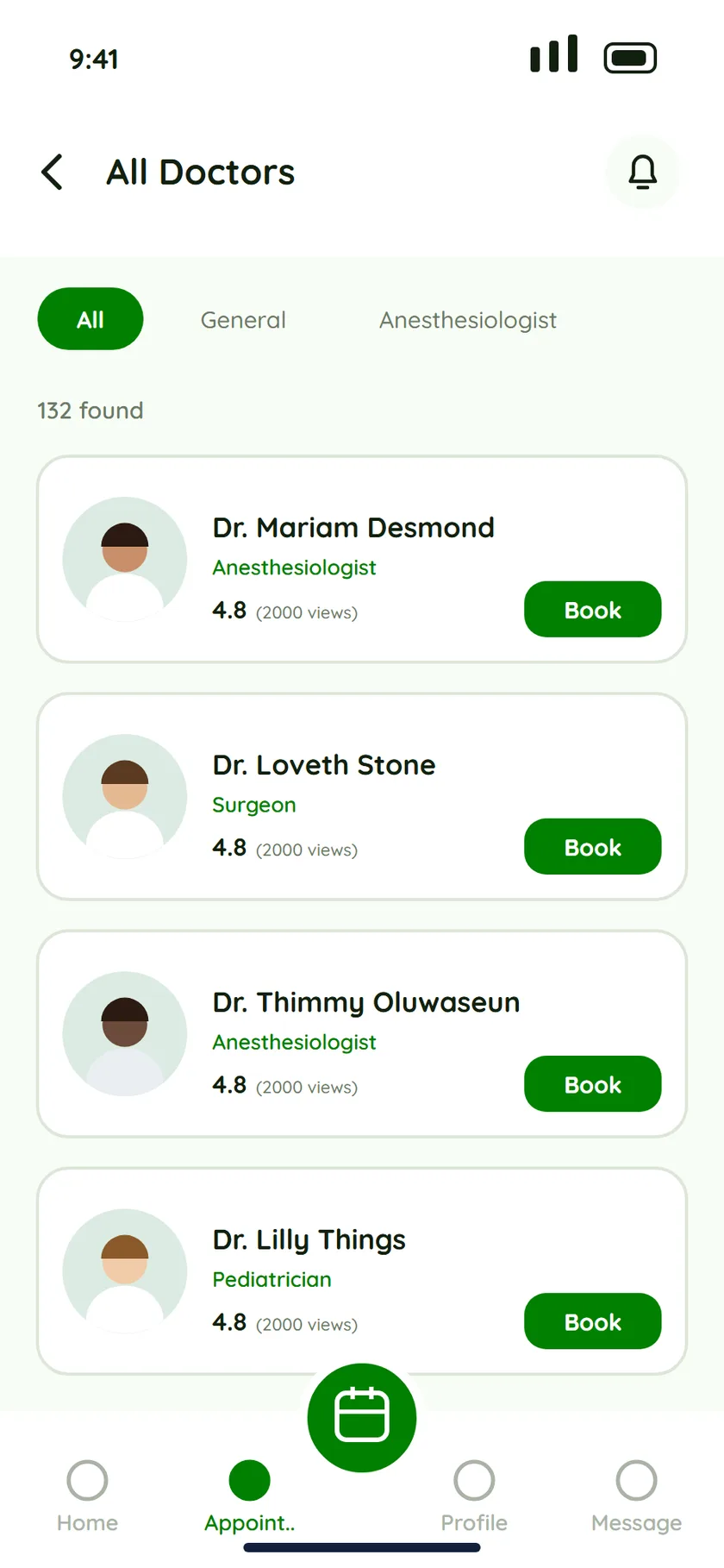
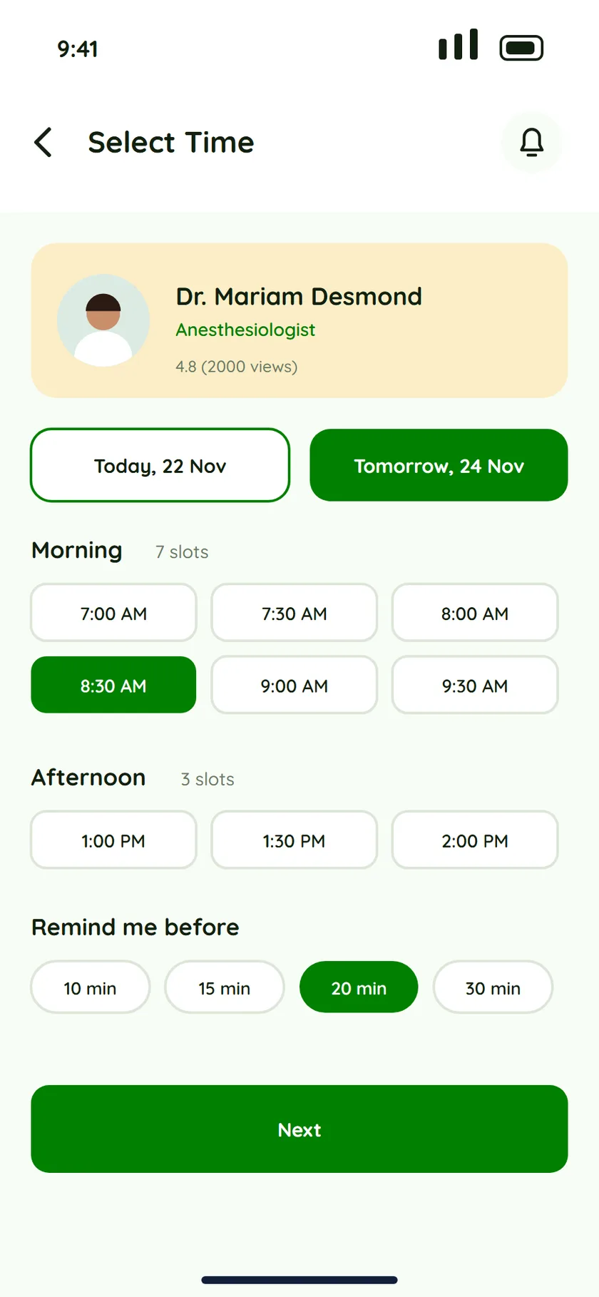
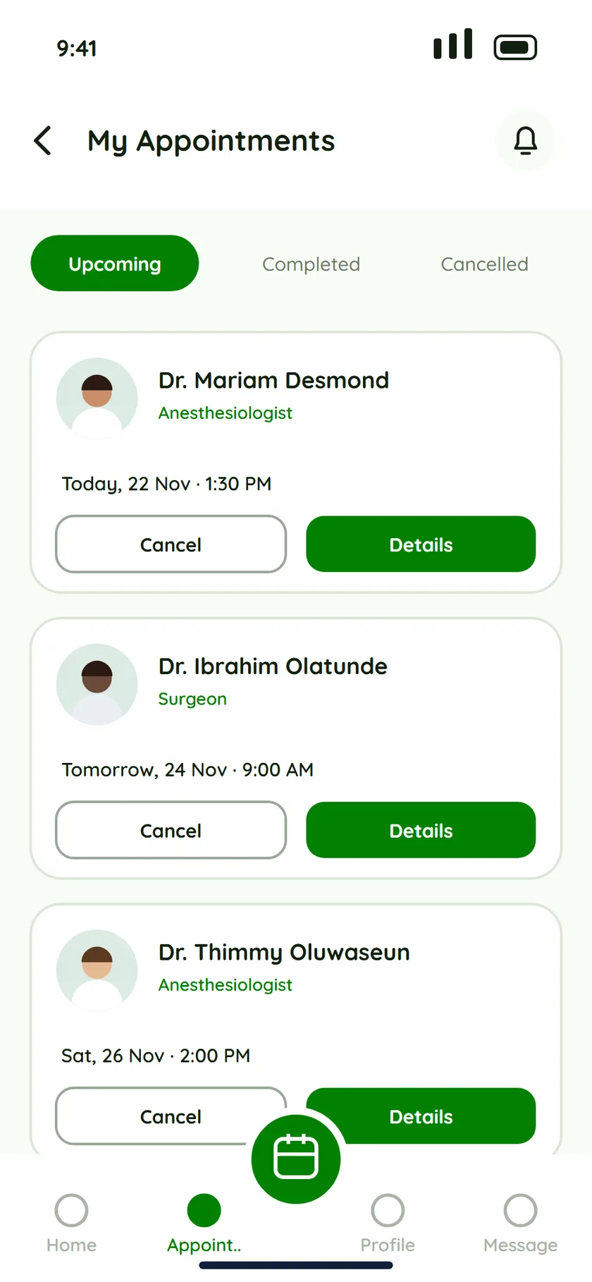
Patients start from a doctor, not a form. They pick a slot, choose how to meet, and keep every appointment, upcoming, completed or cancelled, in one list.
02 · Doctor
Manage the day, not the paperwork.
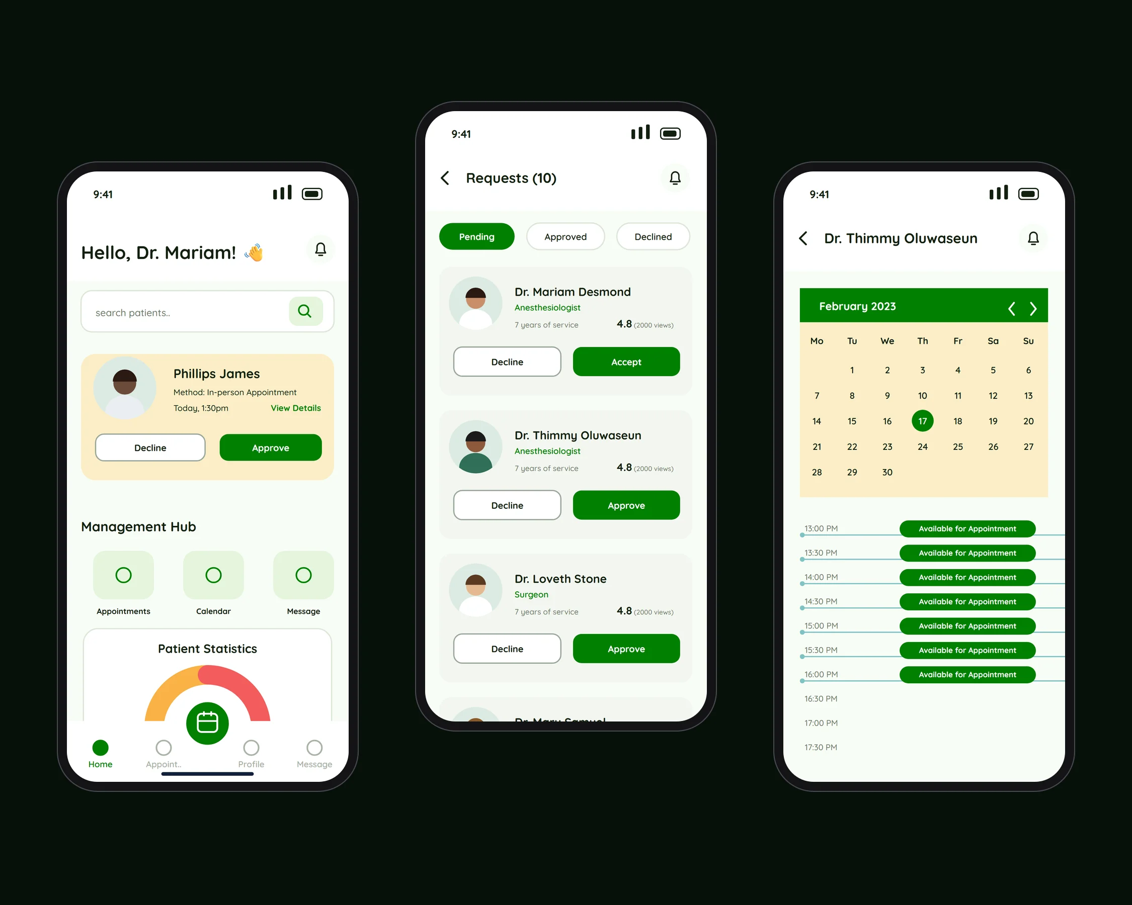
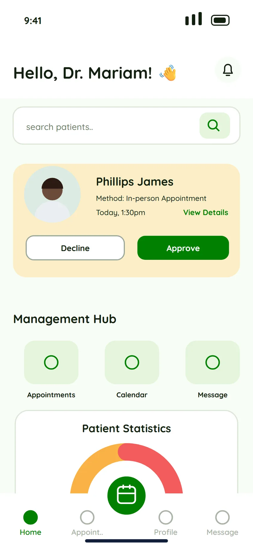
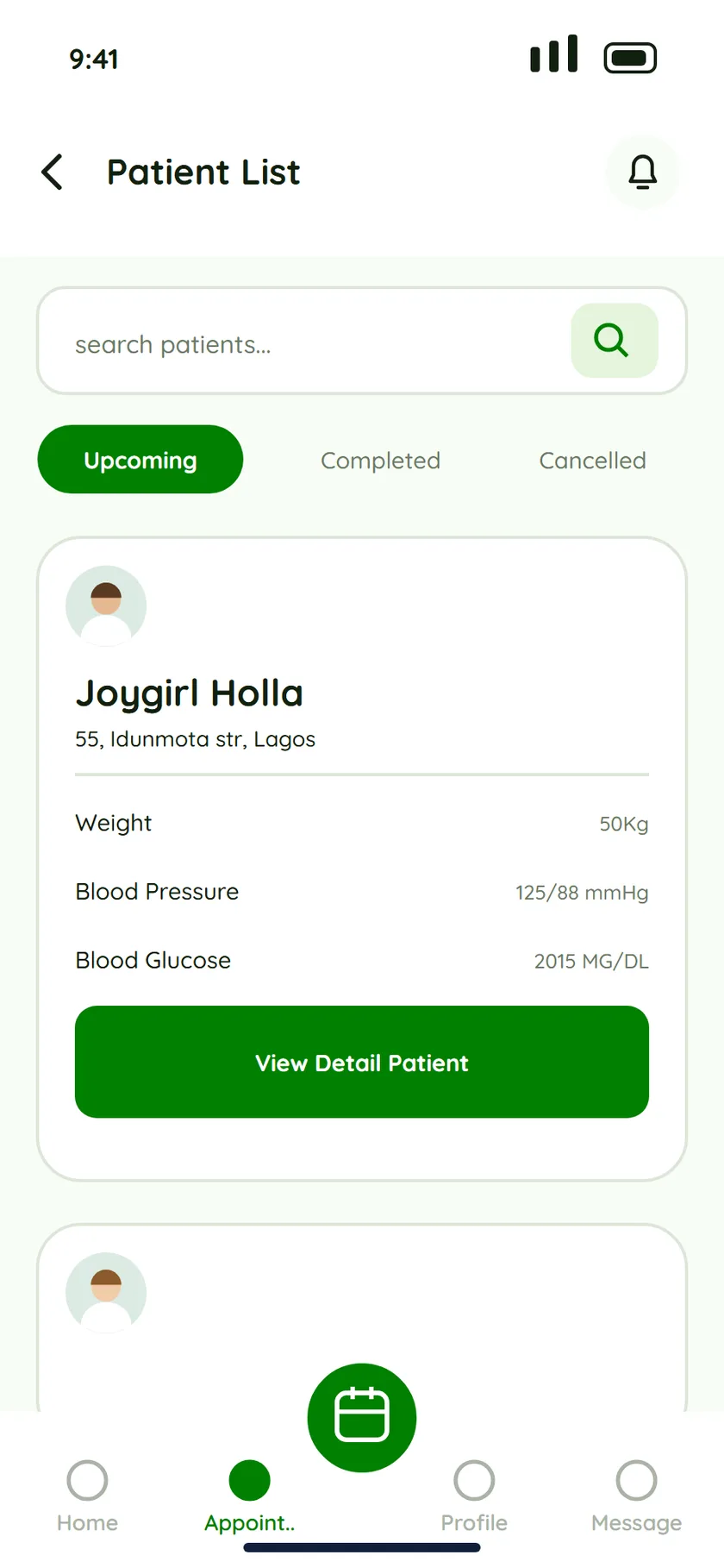
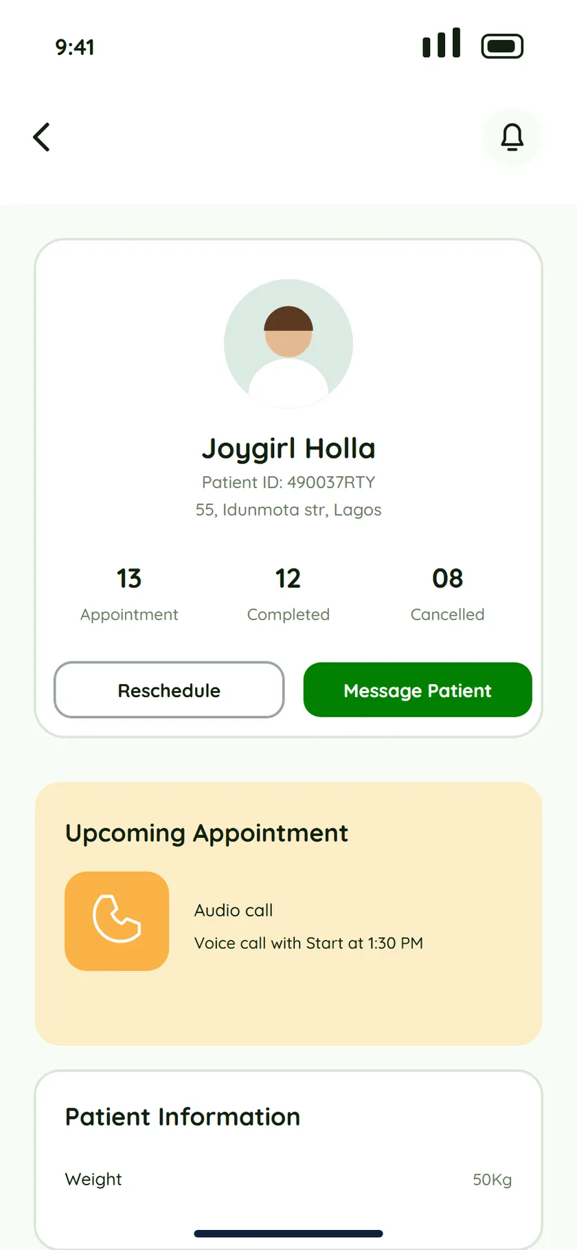
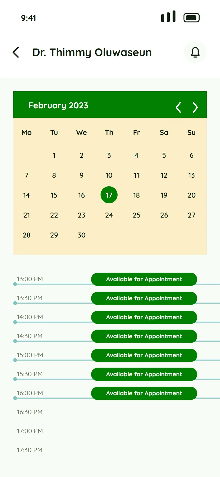
The home screen leads with the next patient request, so a doctor can approve or decline in one tap. A management hub puts Appointments, Calendar and Message one tap away, with a statistics gauge for the week. A patient page shows their counts for appointments, completed and cancelled visits, and the next appointment. The calendar opens 30-minute slots.
03 · Admin
See the whole clinic.
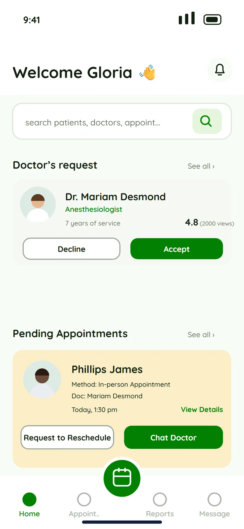
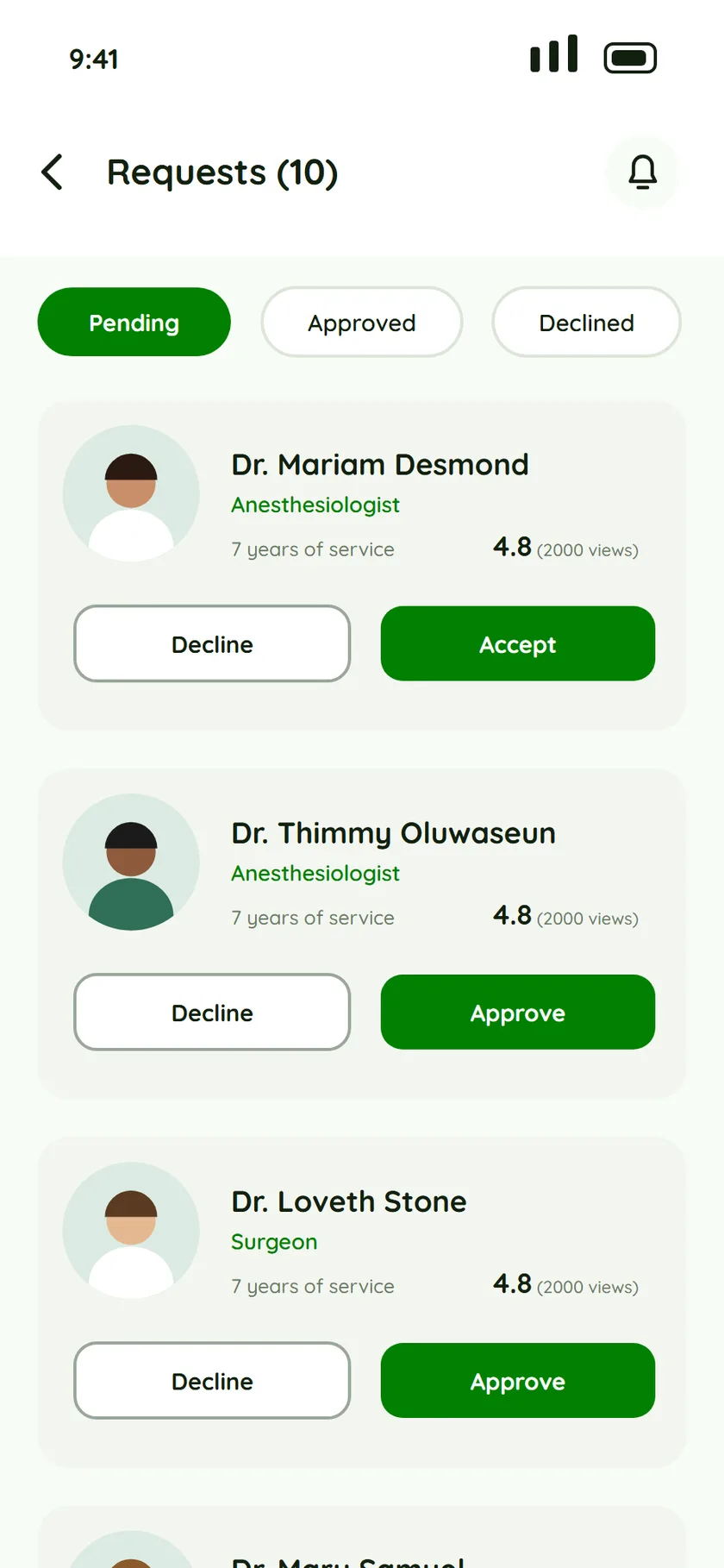
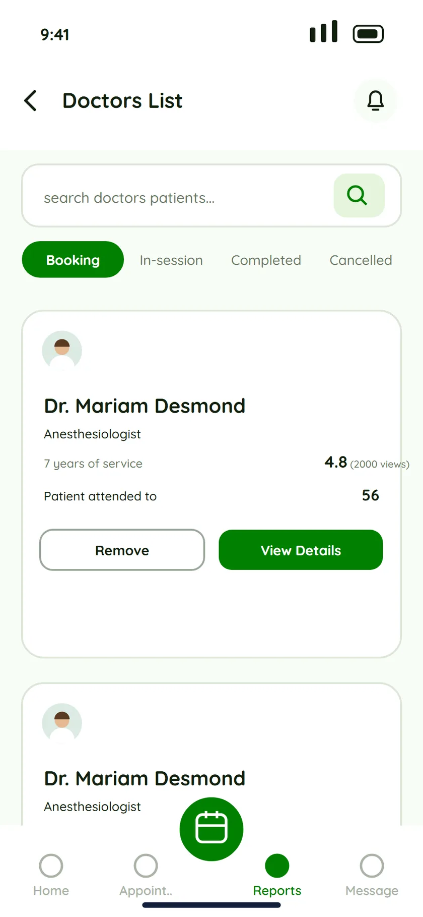
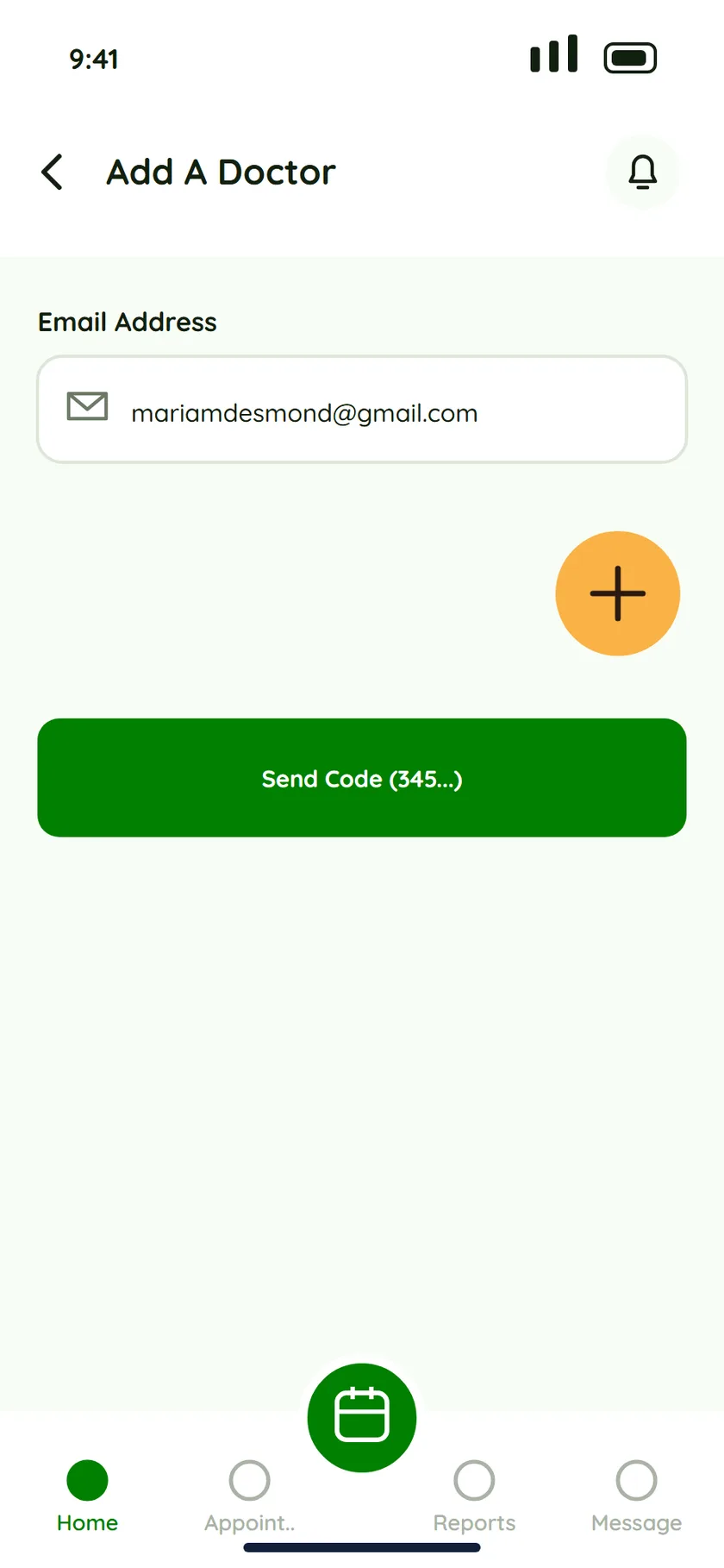
Home shows doctor requests and pending appointments together, each with Request to Reschedule and Chat Doctor. A requests list has Pending, Approved and Declined tabs with a count in the title. The doctors list filters by Booking, In-session, Completed and Cancelled, and shows rating, years of service and patients attended to. To add a doctor, the admin enters an email and sends a code.
Details
Details I’m proud of
One big button in the middle
Four tabs and a raised calendar button sit at the bottom of every role. Booking or checking the calendar is always one tap away.
Rescheduling asks why
The reschedule form offers reasons like an emergency, not feeling well, or just wanting to cancel, plus a box to say more. The doctor gets context, not a silent cancellation.
Cream means “needs you”
Pending requests and appointments sit on warm cream cards, so they stand out from white cards and green stays for actions.
Status at a glance
Tabs and counts are everywhere: Upcoming, Completed and Cancelled; Pending, Approved and Declined; Booking and In-session.
Trust you can read
Doctor cards show years of service, a rating and view count, so patients and admins can judge before they approve or book.
Numbers as a glance
A statistics gauge and the 13, 12 and 08 counters on a patient page turn counts into something you can read in a second.
Palette
The palette, taken from the screens
A friendly rounded sans-serif and four colours do almost all the work.
Action green
#008000
Mint page
#F8FDF6
Cream: needs you
#FBEEC6
Amber
#F9B246
Feedback
What reviewers told me, and what I changed
- “The colour is everywhere.”
- Reviewers asked for a different shade that fit the design. I kept the green for actions and let the neutrals do the rest.
- “Avoid black shadows on coloured elements.”
- I made the shadows soft, or removed them where they weren’t needed.
- “Reduce the text size a little.”
- Large text was taking too much attention, so I brought the type down and rebalanced the hierarchy.
In numbers
The work, in numbers.
These count the work itself. I don’t have launch numbers to share.
- roles designed for
- 3
- personas
- 3
- user stories
- 12
- brief to final screens
- 1 week
Source: the design work itself, not a launched product.
Process
My process, as a to-do list.
The rules I held myself to on Eupnea. Tick one off when it feels settled, remove one you disagree with, or add your own.
Design process
Rules not yet ticked: 10- Talk to all three roles first
- Design for the busiest person in the room
- Booking comes before everything
- Rescheduling is a feature, not an apology
- Records follow the patient
- Telehealth is a first-class option
- Three roles, three colours
- One big button in the middle
- Quieter shadows, smaller type
- Build in a week, then listen
Why it matters
What the design is for
Patient convenience
Schedule and manage appointments without calling the clinic during business hours.
Reduced wait times
Check in online or in the app, so less time is spent waiting in the clinic.
Provider efficiency
Doctors manage schedules and patient information more easily, freeing time for care.
Better communication
Providers and patients can talk through the app, which improves coordination and care.
Contact
Have a role or a product in mind?
I'm open to full-time and contract product design roles with agencies and product teams. I reply within one working day.
joy@hijoygirl.com ↗LinkedIn (opens in a new tab)X (opens in a new tab)Figma (opens in a new tab)