Joygirl Notes
A notes app that feels like paper: lined pages, fonts you choose, and sharing that keeps your note looking like yours.
- Role
- Product design & React Native development
- Platform
- Android · React Native with Expo
- Scope
- Concept to working app
- Team
- Solo
The idea
Notes shouldn’t feel like a blank box.
Most notes apps are a white rectangle and a keyboard. They store thoughts well, but nothing about them feels like yours, and the moment you share a note it turns into plain text.
I wanted to design the app I would reach for on purpose: warm, a little playful, and quick enough that a thought is saved before it’s gone. I designed it, built it, and shipped it as an installable Android app.
The brief I set myself: make a note feel like a page in your own notebook, then let it leave the app looking the same.
Decisions
Four decisions that shaped it
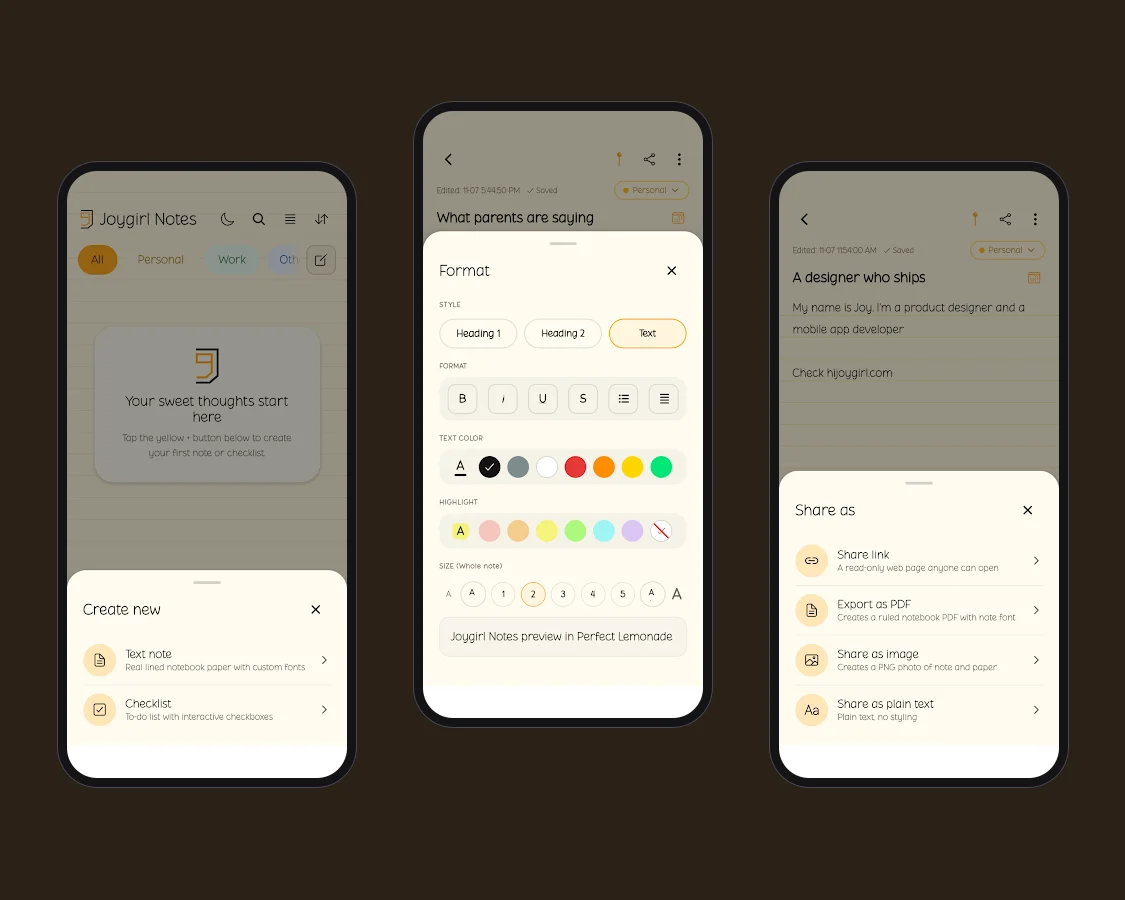
Paper first
Real ruled lines, a cream page and a rounded font. Lines can be switched off for blank paper.
Bottom sheets, not menus
Every action opens in a sheet within thumb reach, so one hand is enough.
Say what it does
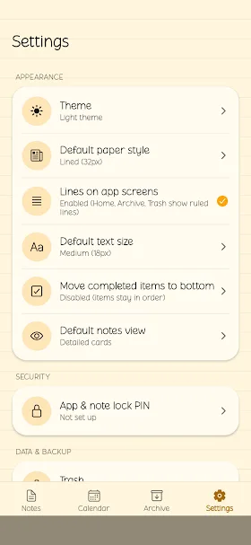
Each option has a short second line, so nobody has to guess what “Archive” or “Export” means.
Sharing keeps the look
A shared note keeps its font, colours and paper. It turns into plain text only if you ask.
Formatting
Formatting that fits in one hand.
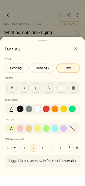
One sheet, five short groups: style, format, text colour, highlight and size. The note stays visible above it, so you see every change as you make it.
Heading 1, Heading 2 and Text sit side by side, highlight turns off in one tap, and the font previews live.
Note options
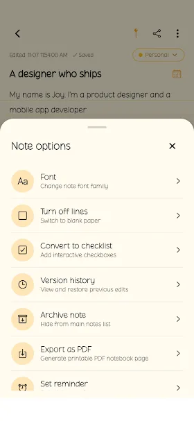
Every option explains itself.
Font, lines, checklist, version history, archive, export and reminders live in one menu. A plain name and a one-line hint tell you what happens before you tap.
Notes are archived, never deleted, and any note can become a checklist.
Sharing
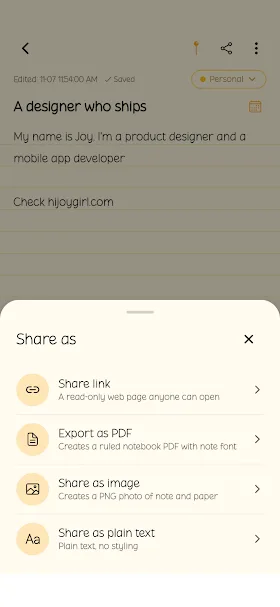
Share it, and it still looks like your note.
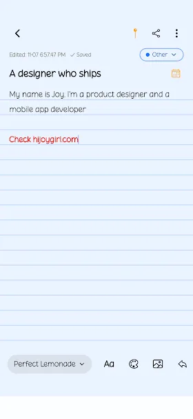
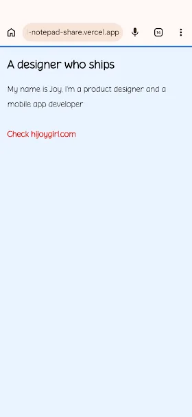
Four ways out, each described honestly: a read-only web page, a ruled notebook PDF, a PNG photo of the note on its paper, or plain text.
The shared link opens on a cream page in the note’s own font, on any phone, with no account and no install.
Details
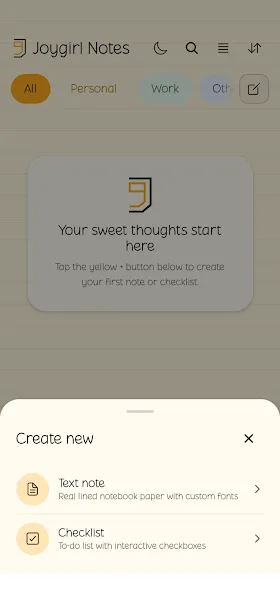
An empty state that invites, and settings that show their state.
Process
My process, as a to-do list.
These are the rules I held myself to while building Joygirl Notes. Tick one off when it feels settled, remove the ones you disagree with, or add one of your own.
Design process
Rules not yet ticked: 10- Research before pixels
- Design for the tired user
- Prototype, don’t present
- Paper first, then features
- One hand is enough
- Say what it does
- Sharing keeps the look
- Systems over one-offs
- Test on a real phone
- Ship, then fix what breaks
Design + build
Designed and built by one person.
Because I design and build in React Native, I could keep the design honest. Anything that felt expensive in code, I simplified in the design. The paper lines, the bottom sheets, version history and the PIN lock went from Figma to working screens without a hand-off in between.
- One paper component
- Lined, ruled and blank paper built as one component, driven by a single line-height setting.
- One bottom sheet
- One reusable bottom sheet for formatting, note options, sharing and creating.
- One set of colour tokens
- Light and dark themes from one set of colour tokens.
- Shipped as an Android app
- Shipped through Expo’s build service as an installable Android app, with 16 test builds along the way.
Testing
Bugs I found by using it
Testing on a real phone showed me two places where the promise, “it still looks like your note”, was broken. Both were design problems that only showed up in code.
The shared link forgot text size
A note set in large type opened in Chrome at one size. The cause was the web page’s cleaning step, which stripped the size information before the note was saved. I fixed it so headings and every text size survive, on the page and in its styles.
Share as image was blurry and plain
The picture flattened the note to unstyled text and was captured at low resolution. I rebuilt it to keep bold, italic, underline, strikethrough, colour, highlight and size, read the latest note content before capture, and export a sharp 3× PNG.
I added automated checks around both fixes. The full suite now runs 105 checks across 11 suites and passes before each build.
Lessons
What I took from it
A small app is a good place to practise restraint. The most useful work was deciding what each sheet should leave out, and writing the one line under each option that spares someone a guess.
Next I want to test the sharing flow with real readers, and see whether people choose the link, the PDF or the image most often.
Contact
Have a role or a product in mind?
I'm open to full-time and contract product design roles with agencies and product teams. I reply within one working day.
joy@hijoygirl.com ↗LinkedIn (opens in a new tab)X (opens in a new tab)Figma (opens in a new tab)